Sync Design System - Solving inconsistencies in Twitch’s interface
Twitch

Overview
Twitch is a platform that allows users to create and consume live streamed video content relating to games and lifestyle. The ultimate goal of the platform is to allow creators to build community around shared interests and values.
However, Twitch has inconsistent design patterns that limit the possibilities of achieving this goal for all users. My team of four UX researchers Sync is a design system that aims to standardize components, typography, and visual language to help teams build faster and more consistently across the platform.
The documentation can be found at https://zeroheight.com/588cec128.
My contribution
UX Researcher
The team
3 other UX Researchers
Timeline
March - May 2026
Deconstructing and auditing Twitch’s current offerings
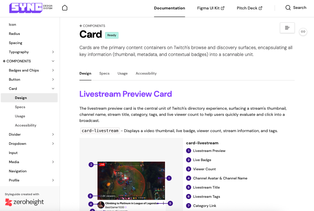
In order to figure out what inconsistencies exist in Twitch’s platform interface, we conducted an audit of the three main pages of Twitch: the homepage, livestreamer page, and category page. We chose these pages because they are the most visited pages of the site and contain a majority of the components that are reused throughout the platform.

The audit consisted of creating an inventory of every asset that existed on the aforementioned three pages: navigation, forms, images/videos, icons, buttons, blocks, graphics, color, and typographics.
Identifying inconsistency on the platform
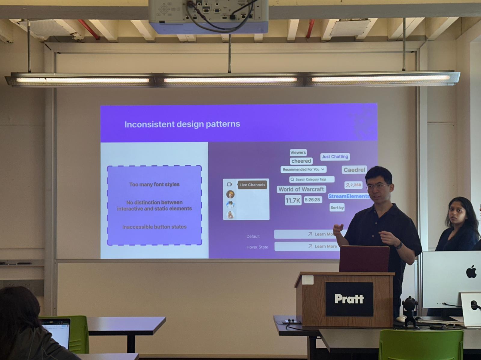
Currently, Twitch has great engagement on their platform, but through the audit, we identified inconsistent design patterns that limit the amount of success they could achieve.

- Too many different font styles - Twitch’s typography is pretty consistent in using Roobert for headings and Inter for body text, but for the stream runtime they use Helvetica Neue, a font that is used nowhere else in the design system. This discrepancy demonstrates a lack of cohesion in design and execution in the site.
- No distinction between interactive and static elements - For many gray buttons, the difference between the default and hover states is a tiny shift in shade. This makes the UI feedback easy to miss, especially for people scanning quickly or with lower contrast sensitivity.
How does this affect Twitch’s audience?
While minor in the grand scheme of Twitch’s product offerings, these details can have a major effect on both users and Twitch’s product team.
- For users: Inconsistent user experience causes loss of trust in brand
- For designers: Time wasted on rebuilding the same components
- For engineers: Ambiguity in implementing new and existing components
Introducing: Sync Design System
In order to address these issues, we built out an unofficial design system for Twitch, which we called Sync, named for how Twitch needs coordination with every area to succeed: users, designers, engineers, and others responsible for building Twitch.
Sync is built with following design principles to ensure that Twitch is structured enough to give users an idea of how to get started, but flexible enough to create their own personal corner of the internet.
- Community first design - Sync provides audiences with the tools and structure to curate a community that is personal and authentic. Every feature and interaction is in service of the goal of connecting users no matter their background or location.
- Creators lead - Twitch is built for creators, including those who broadcast on the platform and for those working behind the scenes. The assets provided in Sync are customizable and understandable for both newer audiences and experts who have been there from the very beginning.
- Build for what's next - This UI kit creates a flexible system that allows designers and developers to focus on the future with easy to use, modular components. Through simplifying the way designers can build pages, Sync provides a baseline for further creativity.
Foundations of the component library
In building the Figma component library, we made sure to account for the aforementioned principles in the following ways
Consistency through design tokens
Using tokens allowed us to systematize Twitch’s color selection, creating clear connections with the most low-level information (hex codes) and the highest level information (alias tokens).

This allows designers and engineers to know exactly what colors should be used for what purpose. These tokens and styles are easily accessible with the UI Kit, making it extremely easy to design new pages or update any branding. Additionally, we optimized and standardized Twitch's typography by reducing the number of fonts used on the website and providing clear instructions on how to use the styles.
Accessibility through clarifying interaction states
Previously, it was not obvious what state a button was in at a glance, so we made sure that every button interaction in Sync was distinct. Similarly, we wanted to tackle alternative navigation styles, to ensure that users are able to interact with Twitch no matter their needs.
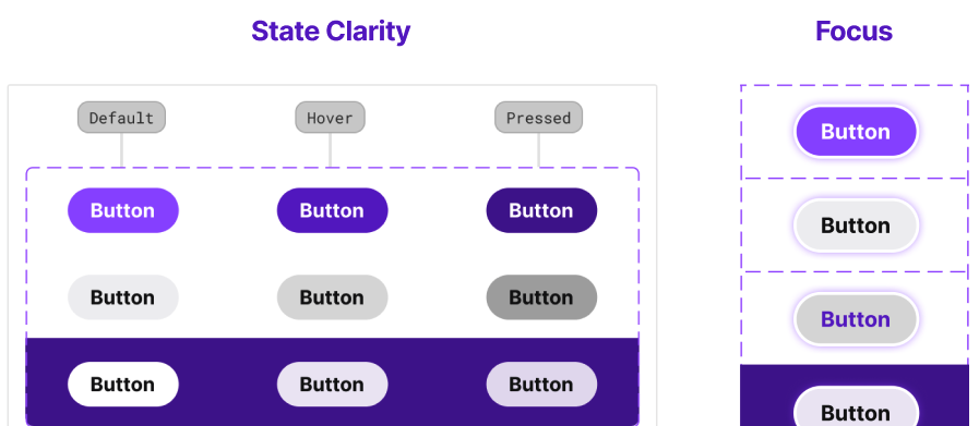
For example, the focus ring that appears when a user navigates to a button using their keyboard now has a light purple focus glow to stay consistent with Twitch's visual identity.
Scalability through customization
We included all predetermined typographic and spacing conventions in Figma’s component properties so designers are able to insert instances that perfectly fit their needs with just a couple of toggles or changes in the assets detail page of the UI Kit.

Showing the component library to real users
After completing the component library, we conducted four user tests with designers, asking them to recreate the Twitch homepage and give feedback on what did and didn’t work.
The most important piece of feedback we received (heard in three out of four user testing sessions), was that there were too many assets on each given page. We had separated the assets into three pages based on. However, the titles used did not give the participants an idea of where they would find specific elements that they needed to build the homepage.
Specific quotes from the user tests:
- “There's a lot of small components to go through, labeling different sections would be better.”
- “Overall it seems like you have everything, but it’s a bit hard to find things, maybe divide it up more.”
- “There’s too much stuff in the assets category. If I wanted to design more, it might take longer to search for the things I wanted.”
Socializing the design system through documentation
In order to properly socialize the design system to all areas of the Twitch team (designers, engineers, managers), you need documentation that explains how and when to use the UI kit provided. We included five different sections to the documentation: About, Foundations, Components, Resources, and Disclaimer. These covered all uses of the design system, including onboarding, use of the UI kit, accessibility, and governance.
Conclusion: Pitching Sync to the team
The final step of the project was presenting version 1.0 of Sync to an audience asked to act as if they were Twitch internal stakeholders. We received good feedback on the storytelling and explanation of how the design system solved the issues brought up by the audit.
Over the course of this project, I learned that building design systems is an exercise of persuasion just as is it as design. A major part of socializing the design system is making an effective impression on the audience through visuals. we don’t have to show every single component and design decision made in the process, but adding a simple animation of how the system can be used to easily build existing pages can go a long way in letting stakeholders understand the benefits of adopting a design system. If we were to move forward with this design system, we might slowly work on introducing new components found on the pages from the signed in user's point of view, as we only focused on design elements present when the user was signed out.