The importance of user control - Using eye-tracking to evaluate checkout flow
Hooked On Phonics
Overview
Hooked on Phonics is an educational company founded in 1987 that provides reading program materials to teach children phonics. They have become a mainstay in the educational world through their continued ability to provide engaging products aimed at the critical stage of early learning.
The Hooked on Phonics team reached out to Pratt’s research team in order to improve the conversion rate of their checkout user flow and modernize their e-commerce operations. Using eye-tracking usability testing, our team was able to evaluate the aspects of the current design that caused friction and provide recommendations to bring the Hooked on Phonics website in line with user’s expectations of a seamless checkout experience.
Our recommendations included adding features that aligned with industry standards, increasing visibility of key CTAs, changing visuals to add more contrast, all of which served to directly or indirectly give the user more control without sacrificing scanability.
My contribution
Rex Fukuchi - UX Researcher, Editor
The team
Shriya Chipde - UX Researcher, Administrator Claire Jen - UX Researcher, Manager
Timeline
September -December 2025
Sounding things out: Guiding the research
The Hooked on Phonics shop has never undergone a major overhaul and currently falls short of modern e-commerce standards. Navigation, trust signals, and clarity are limited, which may discourage users, especially when faced with higher-priced products. Cart abandonment, bounce rates, and poor mobile usability are known pain points, creating friction for users trying to complete a purchase. While subscriptions remain the primary revenue stream, there is an untapped opportunity to increase one-time and add-on purchases, particularly if the cart-to-checkout experience becomes smoother and more intuitive.
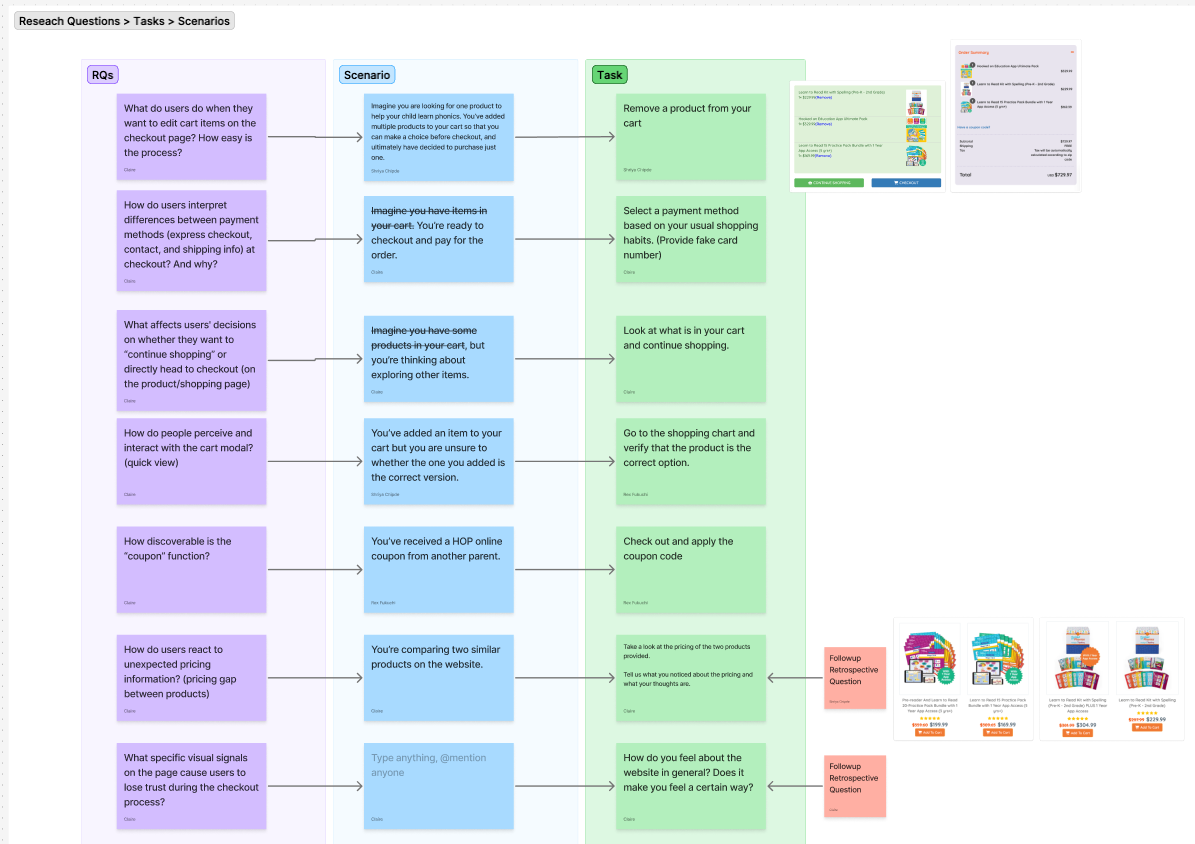
After the kickoff meeting with the client, we defined three main research questions to guide our research study:
- How do users perceive and interact with the shopping cart?
- What specific visual signals on the page cause users to lose trust during the checkout process?
- How does the checkout flow and interface differ from users’ expectations of a modern website?
Hypotheses
Through an audit of the site, we came up with a list of hypothesis that detailed identifiable issues in interacting with the checkout flow:
- Users will struggle with tasks due to a lack of clarity in the visual cues and components, specifically in the pop-up cart and the coupon section.
- Users will perceive the site as untrustworthy for purchasing due to its outdated visual design.
- Users will feel frustration due to a lack of control and flexibility, such as not being able to remove items in the checkout page.
As our team’s editor, I was responsible for proofreading deliverables for consistency in tone and style. Ensuring that our documents and presentations were transparent and non-technical was essential in maintaining buy-in from the client for our recommendations.
Picking up the pieces: Designing the eye-tracking usability study
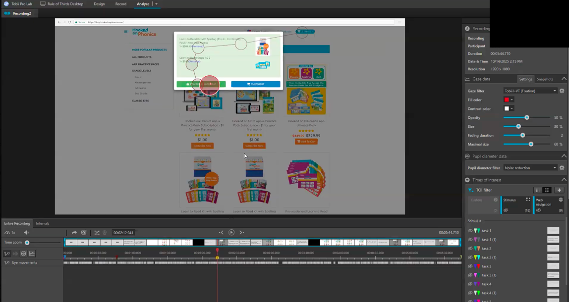
We selected eye-tracking usability testing as the primary method, supplemented by retrospective think-aloud and post-session interviews. This method would allow us to test how users engaged with specific visual aspects of the checkout experience and learn about their thoughts through verbal insights.
We recruited seven participants with previous experience online shopping, four of which did the study using the mobile version of the Hooked on Phonics shop, and three of which did the study using the desktop version. Utilizing both the desktop and mobile versions allowed us to gauge whether specific pain points were specific to each interface or could be generalized to the site as a whole.
At the end of each usability testing session, we conducted a Retrospective Think-Aloud (RTA) and a System Usability Scale (SUS) survey to gather both behavioral and attitudinal insights. These methods helped us obtain a first-person perspective of user reasoning during key interactions, validate eye-tracking and behavioral observations, and identify usability patterns across participants.
Our client also supplied us with existing VWO website analytics consisting of clickmaps and user recordings. While we were confident our user testing would reveal valuable data about areas of the site needing attention, we wanted to supplement our own research with existing analytics to see how our findings fit into the larger picture of the site’s ability to convert users.
Results
Common areas of friction
Through our 7 eye-tracking sessions, we kept details of common user behaviors and emotions displayed during RTA in a rainbow spreadsheet, which better allowed us to identify which parts of the checkout flow had the most friction.
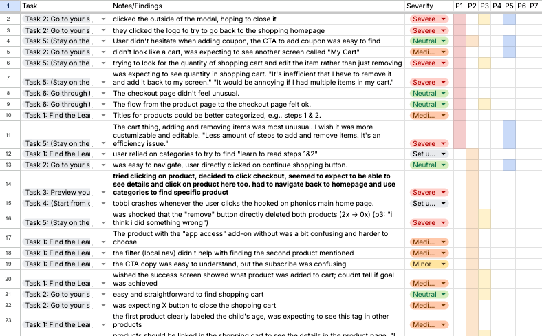
We determined that the greatest amount of attention needed to be directed towards the shopping cart modal interaction and cart usability which, in most cases, was missing critical functionality or worked opposite as expected.
System Usability Score
Users felt they didn’t have flexibility with using many parts of the site, and that they had to take additional steps to complete tasks. We calculated the system usability score with results from the post-test survey and ended up with a SUS score of 46.1 out of 100, which is below average.
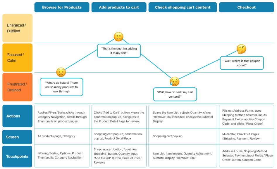
Defining the User Journey
Using our rainbow spreadsheet and system usability score results, we put together a user journey that was a visual representation of when and where problems occurred in the checkout flow.
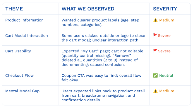
Findings and recommendations
We identified the three most significant areas for improvement within the Hooked on Phonics checkout flow:
- Users expected more visual indicators and control over shopping cart functions.
- The UI design of the shopping cart affects users’ efficiency.
- The checkout page has an outdated layout that hinders user flow and navigation efficiency.
Desire for more visual indicators and control over shopping cart functions
Shopping cart’s functionality is unclear
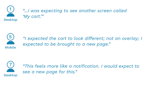
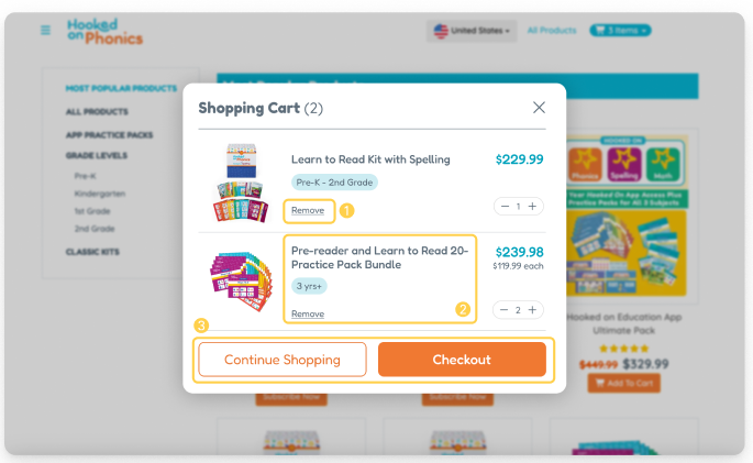
Through our retro-active think aloud sessions, we found that 3/7 users wanted an individual shopping cart page or screen and 2/7 users wanted clear labels or icons to indicate they are looking at the shopping cart.
Struggles with cart modal dismissal

All 7 users struggled with the cart modal dismissal, with 4 users instinctively clicking outside the modal boundary to try and close it. The VWO click rate heat map also showed dead clicks outside of the modal, indicating that users outside of our participants also tried taking action outside of the pop up to leave.
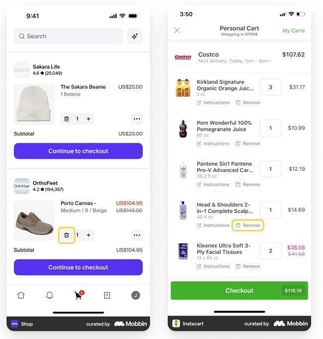
No product quantity control options in cart
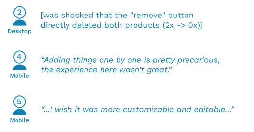
When tasked with adding extras of products already in the shopping cart, users were surprised that there were no product quantity control options in the cart besides “remove”. All 7 users in the RTA professed a desire for the option to add, not just subtract items within their cart.
Recommendation: Introduce more user control to shopping cart
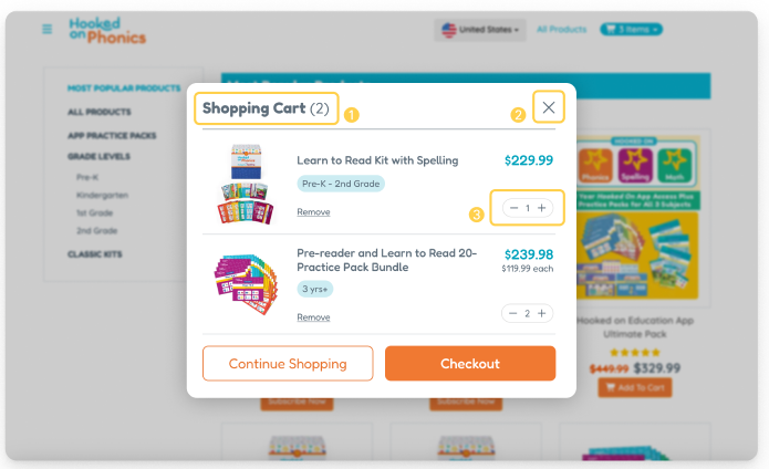
In order to address the issues revealed through the eye-tracking tests, we recommend adding (1) a title to the shopping cart overlay to provide recognition over recall of where the user is, (2) an “X” in the top right corner to align with industry standard of how to exit an overlay, and (3) a product quantity control to give users better control over reaching their goal.
Shopping cart UI design affects efficiency
Small font size and low contrast in color affects comprehension
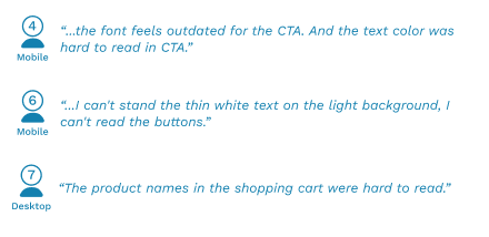
A common remark during the RTA sessions was that text and background contrast was insufficient for scanning, especially in the shopping cart modal. In particular, the small green text on the green background of the shopping cart scored a 4.51:1 on the WCAG rating, which fails AAA accessibility guidelines.
Struggles to find “Remove product” button
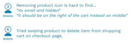
3/7 users found it hard to find the ‘Remove’ button and took other routes to remove target products. In referencing other ecommerce platforms, we found that they used an adequate amount of space in between the product title and remove button.
Recommendation: Use visual design to create more intuitive hierarchy
We recommend making distinct visual changes in the shopping card modal to better communicate to users what information is important. These changes include (1) spacing out the remove button between with other content with white space, (2) making product information easier to scan through with the product age group tags, and (3) providing high contrast buttons that meet accessible WCAG standards.
Outdated checkout page layout hinders user flow and navigation efficiency
Trouble finding entry fields in expected locations
Throughout the eye-tracking sessions, users on the checkout page demonstrated scattered movements when trying to find specific areas to fill in information, with the coupon code field (3/7 users) being a notable culprit. This is majorly attributed to the coupon code field being hidden behind a small text button.
Users could not easily return to previous page from checkout page
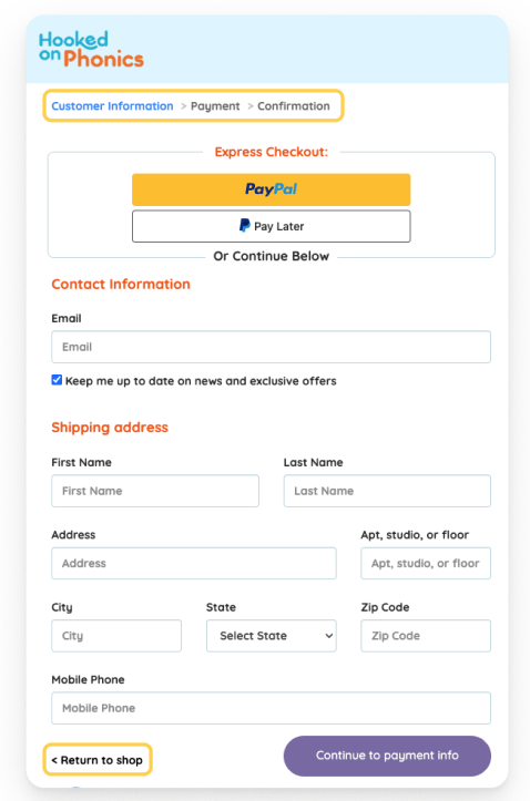
On the current checkout page, the only way to go back if you make a mistake is through a small button labeled “return to shop” at the bottom of the checkout form. This caused confusion for 3/7 users who, seeing a breadcrumb trail already at the top of the page, assumed that they had to click the logo, which instead brought them back to the homepage of Hooked on Phonics. This was validated by the VWO heat map analytics showing clicks on the logo.

Recommendation: Elevating areas of interest on checkout page
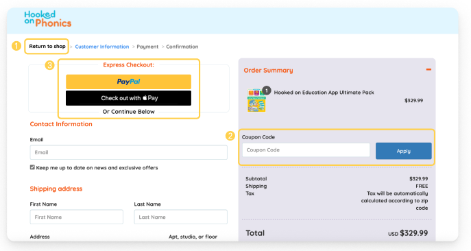
We recommend making the following changes above the fold on the checkout page (1) moving “return to shop” link from bottom of page to breadcrumb trail to increase visibility and user control over flow and (2) ensuring “Coupon Code” entry field is visible on arriving at page instead of hidden to increase trust and scanability of page.
Conclusion
Our team presented our results to the client, emphasizing how each recommendation was backed up with specific research from our testing sessions or web analytics. The client was happy that our research had validated some of their hunches relating to the checkout process, especially in relation to the shopping cart interface and visual accessibility. In fact, Hooked on Phonics had already begun implementing the shopping cart quantity controls that were directly in line with our findings.
While we gained valuable knowledge and experience using the Tobii eye-tracking software, the biggest takeaway from the project was how intertwined quantitative and qualitative data is in creating insights. Data on its own is a useful tool to learn about trends on a global scale, but gathering the individual reasoning into these behaviors from the users themselves can give us a more comprehensive understanding of how to improve these interfaces.